Sunday 20 October 2013

Preliminary Task Mock Ups


For my preliminary tasks, I have been asked to create both a magazine front cover and film poster for my film. So that I stand a better chance of creating high quality products, I have produced mock ups for each task that I will produce. This will give me a rough idea on how I will set it out and will allow me to identify if and when any changes should occur. Seen as we changed our film idea half way through recording, the original ideas that I had for the front cover and poster had to change.

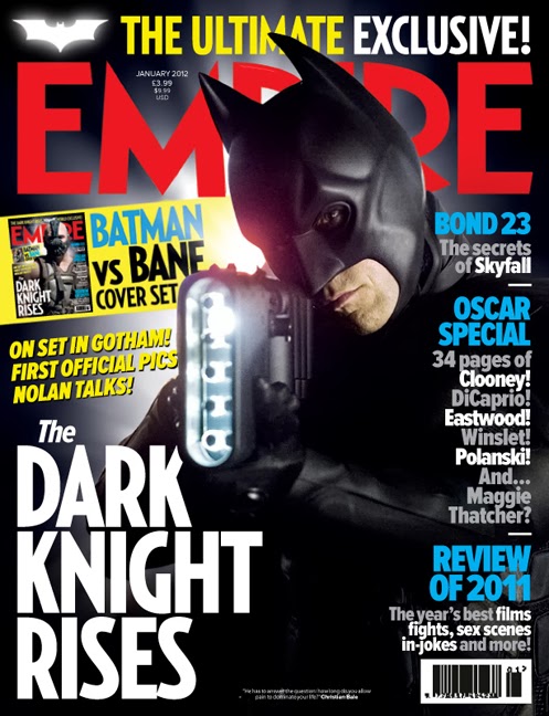
The original main image that I had for my magazine front cover was based on the 'Wrong Turn 4' Poster. I was planning to have a figure (farmer) walking away in the distance holding an axe in one hand and a human head in the other with blood dripping from it. There would be trees to the left and right of the figure to create a pathway with a very foggy/misty air to add effect. The rest of the magazine cover will have been surrounded by other magazine features such as cover lines, a masthead and pugs. I believe this would have made a very effective magazine front cover because the main image and layout had been well thought out. I am still not 100% sure on what image to use for my new magazine front cover however I am still looking to relate it to and make it similar to that of the wrong turn 4 poster as this will be of a good quality. For my original poster, I took inspiration from the Texas chainsaw massacre poster by having a faded mask as my main image. It would not clearly show the mask, it would only show part of it such as in the Texas chainsaw massacre example shown below. The shot for the image will have been took from behind/side of the face so that it does not show the full identity of the killer. This adds a sense a mystery which may appeal to viewers and entice them to see the movie, therefore making it an effective aspect to my advertisement and promotion campaign.


The current idea that I have for my new poster is to have a picture of a swing in the air with a mask either attached to it or on the floor beneath it as this will give a very spooky , mysterious and eerie feel. Although I am not sure exactly what images and text I will be using on my magazine cover and poster, I have still set it out with a rough design which will give me an idea and make sure that I am not making it up on the spot. I will try and make my preliminary products as good as possible and make sure that they are effective in advertising my film. As you can see from the posters above, they have very similar features such as the similar style of font. I will take note of this and use it on my own product so that it looks professional and of a high quality. I will also have to take other effective features such as glow and shadow into account to see if it improves my product. Overall, the most important feature to any front cover or poster is the main image used so I will need to make sure that I have a variety of options to choose from and see what looks the best.

Company Name and Ident

When producing our horror trailer, we have needed to make up a production company to feature in it in order to make the trailer look as effective as possible. This company will represent the film, and therefore the trailer so me and my group took the time to think of the best name possible. The companies name will feature as an ident at some point in the trailer so we have also needed to think about how this will be designed and created in the best possible way.

When thinking of names for our production company, we each listed words that have the connotation of relating to horror films which is the genre of our trailer. A famous example of this is with 'Twisted Pictures' who created the Saw franchise. From hearing the word 'Twisted', we automatically presume that the films that they create will be of a disturbing and sick nature, which is exactly what they are, taking Saw for example. We went ahead and created a list with words including, 'Disturbed, Possessed, Dungeon, Alley, Cellar, Nauseated, Impaired, Rotten and Deceased'. Whilst putting several words together, we all agreed that 'LoftLight Productions' sounded very effective as it would set the mood for our film up perfectly. It doesn't give too much away of the film or our company, instead it adds a sense of mystery and enigma which is exactly what we wanted.

The other options that we each had the choice to choose between were:

- Impaired Productions
- Enigma Studios
- Under the bed pictures
- Empty alley productions

Another reason as to why LoftLight Productions was our final choice is because we have a good idea for the ident to go with it. We are planning to have a point of view shot of someone entering an empty loft in the pitch black. Whilst the loft door is opening we are hoping to have a squeaky sound effect to create tension and mystery. When they open the loft door, they will light a match and the words of our company - LoftLight productions will appear. The only sign of light in the ident will be that of the burning match. This will go well with our trailer as it will look relative to the film and represent our company in a professional manner.

Thursday 17 October 2013

Ancillary - Magazine Research

When creating the front cover for a music magazine as one of two ancillary products, I have needed to do some research so that I can produce the best quality product possible. The magazine that I will create will feature the film that I have made on the front as the main story inside it. I have considered making my magazine of the same genre to my film trailer which is horror, however I believe I will be able to make a much better product if I don't base my magazine around one specific genre as I will have more options and things to include when designing it. The main magazines that I will use as inspiration will be the 'Empire' and 'Total Film' magazines as these are the two biggest movie magazines in the world. I believe they have become so popular because they have not limited themselves to talking about one specific genre of film. Instead, they talk about every genre, even the less dominant ones such as sci fi and animation.


Both magazines follow their own house style for each issue with their own unique font and layout. As you can see, they both look very effective as they follow a colour scheme of no more than four colours on each issue. Like with most professional magazines, the main image tends to take up the majority of the page whilst being surrounded by various bits of text and other images such as sub-headings, pugs, puffs and tag-lines.


The main magazines that focus on the horror genre, which is the genre I have chosen for my film trailer are 'Fangoria', 'Shock Horror' and 'Scream'. Although they are not as well known as Empire or Total Film, they are still very effective magazines and a have a huge horror fan base and following of loyal subscribers. As you can see from the examples below, they don't look as effective or professional as Empire or Total Film which is another reason as to why I am not limiting my magazine to horror. Also, they look as though they would not appeal to anyone who isn't a horror fan meaning that the sales figures and profit for the magazines will definitely not be as much as what Empire or Total Films are.

Monday 14 October 2013

Storyboards


Above are pictures of the storyboards that I have created for our film trailer. We had previously created storyboards for our old film idea, however after realising that it came with too many difficulties we decided to change our whole idea. These show the scenes that we plan on recording including what camera shots and sound to include which makes the recording process easier. Obviously there will be more scenes that we will think of along the way, but the storyboards give us a rough idea on where to start from. 

Thursday 3 October 2013

Location Change


As we were recording our film trailer, we encountered several problems such as being low on numbers and mainly having lighting and sound issues. We wanted a lot of our trailer to be recorded during the night time as this reflects a horror film and with the clocks going back, this meant that we had less time to record in the dark making it very difficult to time when the lighting is just right. Darkness would draw very early and we couldn't judge exactly what time it would meaning that a lot of our clips were trial and error with the majority resulting in error. Even when it weren't pitch black and we thought that it would be ok to record, our high quality camera still couldn't pick up image and the resulting shots would be pitch black such as in the example shown.

From the images shown, the majority of our original trailer consisted of exterior shots to go with the storyline whether this may be a pan of the Maghull entrance sign or a landscape shot of the farm/field we were using to record. The images of the forest/woods show where a lot of our action scenes would have took place such as fast paced chases through the woods or a crime scene investigation. I believe the images that I have used represent the location as being effective however the lighting and sound that came with the location were not and made it very difficult to record high quality footage. If we had used the footage that was shot at these locations then out trailer would look very unprofessional which persuaded us to make the decision of changing our location and storyline.

Although some of the clips that we shot at these locations were good, the rest were
taken over by things such as darkness, and the sound of wind and cars which made them unusable. We argued that the sound in clips could have been edited out or altered with in iMovie, but we came to the conclusion that it was best not to bother as it could have actually made them worse making it a waste of time.
I really like the bottom shot of the field as it provided a great scenery for our film with a large open field and hay stacks to support our synopsis of a killer farmer. We experienced drastic changes in the wheather when recording such as rain-showers and sunshine which can be seen in the photo with dark and light clouds. The photo looks very effective when it was shot and we made sure that we had permission to use and record the land off the homeowner who's field it was.