Showing posts with label Research. Show all posts

Wednesday, 5 March 2014

Intrepid Pictures

Along with our own production company ident, we also wanted to include a well known companies in order to show that our film has the potential to be a success. We took time to research other production companies and look at their idents in order to find a suitable choice. When we came across the Intrepid Pictures ident, we thought this was really effective and would look great at the start of our trailer. After researching the company, we found that they specialise in producing and co-financing a number of genres of film - most importantly horror. They are responsible for producing films such as The Strangers and The Hitcher which can both relate to our film in the way that they involve a crazed killer. The word intrepid generally means fearless and this relates to the company's name effectively as it suggests they are not scared of anything - not even a horror film.

When people see this ident at the start of the trailer, they will assume our film we be of a similar quality to their previous works, and if they enjoyed this, then they will most likely enjoy our film too. The ident features a fade into a dark red background where we can see a stormy sky with lightning strikes taking place. There is a black silhouette of a man slowly raising his arms as if he is embracing the stormy weather. Gradually, the storm gets more and more violent with lightning strikes happening close to the man and the words 'Intrepid Pictures' appear. Loud sound effects of the lightning are used in order to make the ident more dramatic and threatening and it has an overall ominous feel to it. I believe it is one of the best and most creative idents I have seen and believe we have used it appropriately as the use of the colour red connotes danger and blood suggesting that they have produced a horror film.


Tuesday, 25 February 2014

Inspiration for my movie magazine front cover

From carrying out research on film posters and magazine front covers for my ancillary products, I came across a very effective looking poster for The Conjuring that included a woman holding up a match in the dark which gives off a very eerie and mysterious feel. I thought this was very original as it is the only poster I have seen with an image like this. The close up shot which is common in horror film products is used to show the womans facial expression of being nervous, as if she is going into the unknown. This further adds to the mystery and supports viewers in being able to identify the film as being in the horror genre. Because I had already decided on the image to use for my movie poster which was an eye, I had chose to incorporate this idea on my magazine front cover as it would look just as effective. By using the image, we have also made it into a clip from the film to use in the trailer which shows continuity between our products. 

Monday, 24 February 2014

Inspiration for my movie poster

When researching movie posters, I found a trend that appeared predominantly in the horror genre. This was the use of a large eye as the main image that takes up the majority of the poster. The use of an eye can have many reasons behind it and carries the connotations of power, good or evil. Historically, an eye can be a symbol of God, protection or even wisdom. From using it in my movie poster, I wanted to get across the fact that 'The Intruder' is watching and that he sees everything. It is said that you can see into the soul of someone by looking into their eye and by having this on my poster, it looks very effective. With an eye carrying the connotations of power and evil, this suggests that The Intruder is not just an ordinary person and that he is some sort of super human who can not be stopped or killed.

Another inspiration for my movie poster was the typography used on The Last House on the Left poster. I believe this looked really effective and captured the horror genre perfectly which made me want to produce something of a similar style and quality. I have used a very similar font to it as well as a blood splatter in the background as this tells viewers that the film is in the horror genre. I have also developed their convention of using different colours when presenting the typography as this gives it a very effective look. If it was all the same colour, it would not look as good and appealing to look at. 

Friday, 10 January 2014

Viral Marketing Campaigns: Carrie & Devils Due

In order to gain a better knowledge of my chosen film genre, i have kept an eye on the marketing campaigns of different horror movies. A great example of the viral marketing technique done right is with the Carrie and Devils Due prank videos. They have each received millions of views from all over the world from their videos being uploaded to the web on sites such as YouTube.

The Devils Due video features an animatronic infant known as the devil baby terrorising hundreds of unsuspecting New Yorkers by jumping up, screaming, vomiting and growling at them as he is wheeled around in a remote controlled pram. The reactions of confusion and terror bought from this were priceless and it definitely helped to promote the film.

The Carrie video on the other hand which was just as successful, features a number of telekinetic acts such as a man getting thrown up against a wall in order to relate to the film. It shocked hundreds of innocent bystanders in the coffee shop which had been used to perform the stunt. In the process, a fake wall and visual effects were used to make it as effective and as realistic as possible. Again, this played a huge part in the promotion of the film and proved to be a great marketing campaign inspiring other films to commit similar acts.

Overall, i believe that the strategy used by the two films was a fantastic method of gaining publicity for the movies as they reached millions of views on their day of release.

Tuesday, 3 December 2013

Todorov's Narrative

In 1969, Tzvetan Todorov produced a theory which he believed can be applied to any film. The theory states that all films follow the same narrative pattern making the features of the theory typical codes and conventions of a film. If each stage has been thoroughly thought out and planned well, the film will most likely become a success. The stages are:

1. Equilibrium
All films start off with a state of equilibrium. This is when everything is as it should be. Not necessarily calm, but stability is ensured in the environment.

2. Disruption
The next stage to the theory is known as the disruption. A disruption of the equilibrium occurs by some action which is typically drastic.

3. Recognition of disruption
The recognition that the disorder has occurred then takes place and ideas are thought of to overcome the disruption.

4. Attempt to repair
Once the disruption has been identified, there is an attempt to repair it. In most films, this is where the majority of action scenes will take place and is the most likely aspect to either make or break the film.

5. Reinstatement of equilibrium
The final stage of Todorov's Narrative is the reinstatement of the equilibrium. There is a return or restoration of a new equilibrium. Whether or not the disruption has been completely repaired, everyone moves on with their lives and a new equilibrium is created.


An example of Todorov's Narrative being applied in a film of the same genre to mine - horror, is in the 2012 hit Sinister which is said to be one of the most sickening films of all time. The film tells the story a typical horror film which would be classed as a 'Monster in the house' in Blake Snyder's film categories.

- Equilibrium:
The film starts off with a family moving into their new house in an attempt to gain a fresh start at life.
- Disruption:
The disruption in the film is when the lead protagonist and man of the house Ellison finds a box of old video tapes in the loft. They each have their own titles attached which makes it even stranger and more eerie.
- Recognition of disruption:
The recognition of disruption occurs when Ellison starts watching each of the tapes and finds out that they are live killings that have been recorded. The killings are very sick and twisted as they have been conducted by children taken over by a demon.
- Attempt to repair:
Ellison attempts to repair the disruption by getting his family together and moving back to their old house - As far away from the current one as possible.
- Reinstatement of equilibrium:
The original equilibrium is not restored, however a new one is reinstated after Ellison, his wife and son are murdered by his youngest child who is then taken away by the demon Bagul.

Another example of Todorov's Narrative being used effectively is in Holes, a comedy-drama based film on the award winning Louis Sachar novel.

- Equilibrium:
The equilibrium in the film is when Stanley and his family are living their normal every day lives, with the men said to be cursed by Stanleys' "No good dirty rotten pig stealin' great great grandfather".
- Disruption:
The narrative in the film sees its disruption when a pair of charity-donated sneakers fall on Stanleys head and he is falsely arrested and sent to Camp Green Lake.
- Recognition of disruption:
The disruption is recognised when Stanley arrives at Camp Green Lake and is forced to dig holes along with the other lads everyday as punishment. Everything the boys find must be handed in, in the hope that it is a clue that leads to buried treasure. Later on in the story, Stanley follows his friend Zero who runs away from the camp.
- Attempt to repair:
Because the boys had run away in the desert, they had no food or water and were at risk of dying to starvation or dehydration. In an attempt to repair this, the boys start to climb a mountain known as 'Gods thumb' in search of food and water which has a relation to the curse on Stanleys family.
- Reinstatement of equilibrium:
The reinstatement of equilibrium occurs once the boys have climbed the mountain and found refuge with food and water. They return to camp and find the buried treasure which leads to the closure of Camp Green Lake and the arrests of the workers there. The boys get to keep the treasure and live happily ever after.

When producing our film, I will need to ensure that I am keeping Todorov's Narrative theory in mind in order to make the best possible product. By using the theory, it will help me to develop a detailed story for our film and make it look professional and realistic.

Thursday, 17 October 2013

Ancillary - Magazine Research

When creating the front cover for a music magazine as one of two ancillary products, I have needed to do some research so that I can produce the best quality product possible. The magazine that I will create will feature the film that I have made on the front as the main story inside it. I have considered making my magazine of the same genre to my film trailer which is horror, however I believe I will be able to make a much better product if I don't base my magazine around one specific genre as I will have more options and things to include when designing it. The main magazines that I will use as inspiration will be the 'Empire' and 'Total Film' magazines as these are the two biggest movie magazines in the world. I believe they have become so popular because they have not limited themselves to talking about one specific genre of film. Instead, they talk about every genre, even the less dominant ones such as sci fi and animation.


Both magazines follow their own house style for each issue with their own unique font and layout. As you can see, they both look very effective as they follow a colour scheme of no more than four colours on each issue. Like with most professional magazines, the main image tends to take up the majority of the page whilst being surrounded by various bits of text and other images such as sub-headings, pugs, puffs and tag-lines.


The main magazines that focus on the horror genre, which is the genre I have chosen for my film trailer are 'Fangoria', 'Shock Horror' and 'Scream'. Although they are not as well known as Empire or Total Film, they are still very effective magazines and a have a huge horror fan base and following of loyal subscribers. As you can see from the examples below, they don't look as effective or professional as Empire or Total Film which is another reason as to why I am not limiting my magazine to horror. Also, they look as though they would not appeal to anyone who isn't a horror fan meaning that the sales figures and profit for the magazines will definitely not be as much as what Empire or Total Films are.

Tuesday, 3 September 2013

Horror Genre Mood Board


Above, I have created a mood board for the horror genre showing all the different characters and props involved. Some of the pictures I have used are from some of the most decorative horror movies of all time including Scream, Jeepers Creepers and The Texas Chainsaw Massacre. Overall, I am pleased with the mood board that I have created as it gives me an insight on what to expect and include when creating my horror trailer.

Wednesday, 28 August 2013

Paranormal Activity Marketing Campaign

One of the biggest reasons behind a films success is its marketing campaign. If a film is hoping to become a worldwide success, it must have an effective marketing campaign that builds a buzz/hype around it to target potential viewers. I have chosen to analyse the marketing campaign behind the Paranormal Activity film as i believe this is one of the best examples of a successful marketing campaign, and it is also of the same genre as my film - horror.

It was a very low budget film made for just $15,000 so it was massively important for the creators to advertise it as good as they could. As you can guess from the title, it tells the story of a haunted house featuring a number of different paranormal incidents that would leave viewers shocked.

The movie was given a limited release with a number of midnight screenings in small towns across America. The company then turned their attention to social networking sites such as Facebook and Twitter to create a buzz about the film. They encouraged the lucky people who had got the chance to see the film during its limited release to write about it with short reviews and with the majority of them being positive and recommending others to see it, this lead to a larger limited release, mainly focusing on college towns as this was where the majority of their target audience of teenagers would be.When Paramount had become aware of the success of the film in these few towns, they knew they had to get the film out on a larger scale. The website for the film which was promoted all over the internet on the likes of Twitter and its trailer allowed for users to demand the film to be screened in their town with the click of a button. This is very effective as it involves users by giving them the power and making them feel like they are a part of the film and its distribution. Paramount said that if it gained 1 million demands, they would release it nationally. Which it did.


Social networking sites such as Twitter allowed for the film to generate even more publicity and awareness as it was featured in the worldwide trending topics for weeks on end meaning that any of the millions of users on Twitter where aware of its presence. With the trailer for the film, they wanted to create something different - to stand out from the crowd. Rather than having a number of clips and scenes from the film edited nicely in a montage that had the potential to spoil it for viewers, they only included a small number of clips from it whilst showing the reaction of a live viewing audience. By focusing on the reactions of the live audience, this would entice viewers to want to see the film themselves and flood cinemas instantly to gain the same experience. Watch the trailer below:

A poster promoting the film was also put up on billboards and walls across the world. It features a very eerie looking photo from the film that attracts viewers attention as well as a quote saying that it is one of the scariest movies of all time. This was sure to appeal to horror movie fans or people who enjoy being frightened in general as this is exactly what they will want. It features a rhetorical question as well as the message "don't see it alone" in order to involve viewers and make them feel apart of the film. It also directs viewers to the films website where they can demand for it to be screened in their area.


Overall, I feel that the marketing campaign for Paranormal Activity was very successful in advertising the film effectively and generating a huge buzz to entice people to go and see it. The campaign itself is the main reason behind why it gained a significant box office taking of over $193,355,800 from just $15,000.

Thursday, 15 August 2013

Synergy in marketing

When companies join together in order to come up with a product that involves advantages for all parties included, this is known as synergy. Synergy plays a big part in the marketing campaign of a film as several different products are created in order to stand a better chance of gaining the film more publicity and attracting potential viewers. These products can include relatable items to the film that promote and advertise it such as magazine and poster covers, video games and even merchandise.

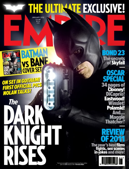
One of the best examples of synergy being used in a films marketing campaign was with The Dark Knight Rises. A number synergy techniques were used to enhance the film both before and after its release with products such as a video game, posters, magazine covers and a number of trailers being released. Each targeted a different section of the media - video game lovers, film fanatics and magazine readers. These were very effective in gaining the film tons of publicity from different media types which suggests that they were the main reason behind the films success.

The first sign of marketing by the film was when the official website was released over a year before the films actual release date. The site streamed an encrypted audio file in which users could decrypt it by using the hashtag "#TheFireRises" on Twitter. Each time this was done, the creators Warner Bros would remove a pixel from the webpage before the first official image of the villain Bane was revealed. A number of different trailers were released on YouTube which each received millions of views and spread rapidly. Different posters and magazine covers were also released having included either the hero Batman or the villain Bane on the front. This way, viewers could choose which side they were on - good or bad. This also built a lot of hype for the film and got people talking - again gaining a lot of publicity for the film. Synergy had been maintained throughout these products as the tagline "The Legend Ends" was included on each one. This was done so that viewers would remember the phrase in the hope that it would entice them to go and see the film. Another way in which features of the products were similar and synergy had been maintained was with the general layout of the likes of magazine covers, posters and images. They each had a very dark and similar look about them in order to add effect and show that it is of the action genre and can be quite dark/moody at times.


The Arkham City video game was another way in which the film was marketed as this would have gotten people talking about Batman in general and with a new film just around the corner, they are bound to go and see it if they enjoyed playing a game relating to it. Synergy had continued to be maintained throughout the marketing campaign as Warner Bros signed a deal with Formula One team Lotus F1 to have the films logos appear on several cars driven in the British Grand Prix. This would have been watched by millions of people around the world and with the Batman logo being displayed not only on this, but every other product, it would have made people want to go and see the film.

Overall, i believe that synergy in the marketing campaign for the film had been maintained effectively and was certainly the main reason behind the films worldwide success.


Saturday, 10 August 2013

Dark Skies Poster Analysis


Above is the analysis that I have done for the Dark Skies movie that was released at the start of 2013. Overall, I believe that it is a very effective movie poster and achieves its aim of advertising the film very successfully.

Tuesday, 6 August 2013

Texas Chainsaw Massacre Poster Analysis


Above is the poster analysis that I have done for The Texas Chainsaw Massacre. I believe that this is a very effective poster for the film and it does the films marketing campaign justice. What I found most effective about the poster, apart from the powerful main image that brings the poster to life is the colour scheme used. The colours compliment each other and make it easy to read the text and view the main image of the man holding the chainsaw which is what every poster looks to do, but doesn't do quite as effectively. I like how the main image covers the entire poster with the clouds and sky varying in colour. I will be looking to produce my movie poster of a similar quality to this as I believe it looks very professional and effective in advertising the film.

Thursday, 1 August 2013

Total Film Magazine Front Cover Analysis

For my second movie magazine front cover analysis, I wanted to choose a different company than Empire in order to see how similar or different they are so that I can pick up any ideas when it comes to creating my own. I chose another huge film magazine company - Total Film and came across the cover that they produced for their "ultimate Batman issue" promoting the new film The Dark Knight Rises. My favourite feature on this cover is the colour scheme as I feel it compliments the film and layout effectively. Not only does the gradient colour of black and blue look very professional on its own, it also links in with the film as a lot of the scenes in Batman take place during night where the sky is black/blue. I will certainly be using this cover as inspiration in order to gain ideas when creating my own movie magazine front cover.

Saturday, 20 July 2013

Empire Magazine Front Cover Analysis


Above is the front cover of an Empire magazine that I have analysed. Empire is one of, if not the largest film magazine company in the world and I believe this is one of the best front covers to have been produced by any movie magazine. Everything about it looks very effective as it follows the codes and conventions of a successful front cover. Because the main image alone is so good, the magazine as a whole will also be, due to it being anchored by the likes of the masthead, sub stories and sub images. I will be looking to create my magazine front cover in a similar way by using parts from this such as its colour scheme and layout as inspiration.

Thursday, 18 July 2013

Sinister Movie Trailer Analysis

The trailer opens with the non-digetic sound of a radio broadcast which informs listeners about a family that have been murdered. From this, we are straight away able to identify the genre as being horror. There are various clips being showed whilst the broadcast is playing with the most dominant being an establishing shot of a house at night - this suggests that this was where the family lived before they were murdered. There are fast cuts of a symbol and pictures including a family with a little girl circled and a crime scene. These give the trailer a very eerie atmosphere and make some viewers jump as a static sound is included which is something we will be looking to include in our trailer. The little girl in one of the cuts is circled in red which connotes danger and blood further supporting the trailer of being in the horror genre. Because she is the only one circled, this gives her the feeling of being vulnerable and that someone or something is watching/stalking her.


When the news report stops, we get the text "9 Months later" appear on the screen before having a zoom in establishing shot of the same house earlier on in the trailer - this time in the day with a van and boxes outside suggesting that people are moving in. The little girl saying "I didn't want to move here" further supports this and we get our first introduction of the family with a variety of shots of them such as them having a family meal. The contrast of the house from when the family were murdered and the new family moving in suggests that they are going to follow in their footsteps and also get murdered. The sound effects and music are typical of a horror trailer as they create suspense to make viewers on edge throughout which is very effective.


As the clips of the family are being played, we get a high angle shot of the little girl who said she didn't want to move there which makes her appear as being vulnerable. From this, we are able to identify that she will play a big role in the film due to vulnerable children being a typical horror victim. The shots of the family around the table and the parents in bed connote a happy, innocent family and that nothing can go wrong - which is never the case in horror films. Low key lighting is used throughout the start of the trailer in order to put an emphasis on the isolation of things such as the location of the house and the attic where the man stumbles across a box of tapes. This adds a sense of mystery to the trailer and gives it an eerie feel which is essential in most horror trailers.


As soon as the man stumbles upon the box in the attic, we get the text "From the producer of Paranormal Activity and Insidious" appear on the screen. If the viewer hadn't guessed it already, this gives away the genre of the film as being horror as these two films are two of the most known horror films in the world. We get an over the shoulder shot of the man looking at the tapes in the box in order to give the effect of actually being there with him. It acts as a kind of point of view shot in order for us to see what he sees. The first tape he watches shows a family having fun together before suddenly jumping with a static sound effect to the family being hung from a tree which is very graphic. The man immediately jumps up out of his seat as I'm sure most viewers did too. By now we can tell that the man of the family is the main protagonist in the film as he has been the main source of attention in the majority of clips so far.


The trailer then cuts to the protagonist discussing what he had found with a police officer whilst another video tape is played which shows a car being set on fire with a family trapped inside. Again, another gruesome clip as this conforms to the codes and conventions of a horror film. The sound effect of a scream is synchronised with the car being set on fire in order to add to the shock of the clip. An extreme close up of the protagonist is then used to show the emotion in his face whilst the flames in the video reflect on his glasses. Extreme close ups are used often in horror films as they show what is going on - mainly emotions such as fear and anger to add effect.


By now, we understand that an investigation has started surrounding the tapes and it is pointed out by an expert that the common link in each of the clips is a special symbol relating to a demon known as 'Bagul'. The expert, who is perhaps some sort of psychologist says that the demon consumes the souls of children and this now gives us a clear storyline. The background music gradually starts to build up whilst showing a clip of a young boy climb into a pool. The music comes to a sudden stop and a high pitched sound effect is used once again to make the viewer jump. Inside the pool is a mysterious looking character turning its head almost directly towards the camera suggesting that this is the demon Bagul who has somehow been transformed from the young boy. The text screen of 'Once you see him' then appears which again, tells us the story and puts pieces of the puzzle together. The protagonist identifies something standing in the background of a still image from one of the clips and we get his narration of "I've never been onto anything this big before". He realises that the image looks a lot like his back garden and that it is the demon Bagul standing in the bushes. He then holds the image up to the window and as he takes it away the demon appears to be stood in the exact same position in his garden for a split second. This is a very effective clip and adds to the eerie feel of the trailer as the garden is pitch black meaning the only thing we see is the demon lit up and the music once again suddenly jumps in an attempt to scare the audience.


By this stage, the demon is clearly identified as the killer and the little girl of the family is at danger from him. As the protagonist is trying to find information from the clips, he has a photo of Bagul on his computer screen with the words “Bagul lives in the images themselves, and they are gateways into our world” playing over it. As he looks away from the screen and closes his eyes which suggests he is stressed and scared, the demon turns its head towards him with a drum beat and another high pitched sound effect to build suspense and continue to make viewers on edge when watching.


The trailer then goes on to show clips of the children acting very strange such as the girl walking around at night time and the boy crawling out of a box screaming as if to suggest they have been possessed and targeted by the demon. These are edited with smooth cuts to make the trailer flow efficiently. A clip of the man setting fire to the box of tapes is then shown before having a close up of them burning to show what it was. It then shows the family fleeing the house with the voice over "Get the kids, pack the car, we have to leave here now". 

A close up of the projector tape rolling is then shown and the trailer is edited to make it look as if it is one of the tapes itself. We have the digetic sound of the tape rolling and clicking with different, short, sharp clips being shown in-between each click. The process of this gradually speeds up and the clicking becomes louder and faster in order to build suspense again. This would be classed as the 'action-part' of the trailer as this is where it gets interesting. As the fast clips come to an end and the music stops suddenly, we are shown a point of view shot of the protagonist as he looks into the attic where he finds a group of what look to be dead children telling him to be quiet. There is a projector screen behind them with an image of Bagul on and he slowly moves off of the screen and appears right in front of the camera with a loud sound effect which again - makes the viewer jump. The title of the film is then shown and the 'Coming soon' screen starts to burn through as the sound effect of the projector tape stops - this suggests the tape has been burnt and is very effective and original.


The trailer conforms to the codes and conventions of a horror film as it continuously builds up suspense with a very eerie and unnerving atmosphere. Extreme close ups are used a number of times in order to highlight things that viewers wouldn't be able to pick up on otherwise such as certain emotions. Establishing shots were used to show the isolation of the location of the house - very large and quiet. The point of view shot, especially at the end of the trailer when Bagul jumps out at the camera is used very effectively as this allows viewers to feel what it is like to be in the characters position. Overall, I believe it is one of the best horror film trailers made and was very successful in its aim of enticing people to go and see the film. 


Monday, 15 July 2013

Saw Trailer Analysis

After watching the Saw trailer several times, I have clearly been able to distinguish the fact that the movie is of the horror genre. I have been able to identify this through the trailers use of camera shots, editing, sound and mise en scene. I would guess that the movie will have been rated 18+ as by the looks of it, it includes a lot of content related to crime such as drug use, murder and violence. The trailer has been able to tell me that the film certainly isn’t for the feint of hearted.

The first thing we see in the trailer is a man walking round a house taking photos. This is hard to see as the lighting is very low in order to create tension and suspense which is exactly what it does. At the same time, it is very effective as the camera has a flash which lights up the room every time a photo is taken. This allows the viewer to identify where the man is, however we have no clue as to why he is there. The flash helps us to see that the house is quite messy and perhaps abandoned due to the use of a bike, dishes and clothes left around. Whilst this scene is happening, there are a variety of shot types used. Most notably the over the shoulder and point of view shots. This gives the viewer the feeling that they are actually there with the man taking photos which is a very effective technique as there is a very eerie atmosphere to the scene which will make the viewer on-edge. Sounds effects also help with the atmosphere of this scene with spooky digetic sounds such as floorboards creaking, a strange voice laughing in the background and the camera shot noise. This gives us the feeling that someone or something else is in the house with the man and he asks ‘Who’s there!?’ The scene then closes with something jumping towards the camera with a huge sound effect which sets the trailer up perfectly with a very on-edge and uneasy atmosphere.

An ident is then used to show the production company’s logos whilst being in synch with sound effects. One of the companies is called ‘Twisted Pictures’ which straight away suggests that they are involved with the horror genre. The logo also helps us identify this as it includes a nail, barbed wire and very sharp font.

The trailer then goes into a rhythm of short, fast paced cuts and edits of scenes from the film in order to show a lot of the action that happens. Again, sound is used effectively as it is often synchronised with cuts and scenes from the film itself. We can identify that the anti-protagonist or main villain in the film is known as 'Jigsaw' through the use of newspaper articles about him as well as a dialogue voice over quoting 'The jigsaw killer'. There are various shots of different characters in the trailer who could be Jigsaw. This is done to entice the viewer to see the film so they can find out who it is and what he looks like. This is a very effective technique as they are not giving anything away or spoiling the film for the viewer. It will make them want to view the film even more.

Sound is used effectively again by having a voice over of 'Jigsaw' who seems a very intelligent man as he knows a lot about the victims including their names and their background. The voice sounds very husky-like, as though it has been edited so that Jigsaw's identity is not given away. Even if it hasn't, the voice still sounds very effective and mysterious which is a better option than using just a normal voice.

The cinematography is another aspect to the trailer that has been used effectively with the use of close up and extreme close up camera shots of people's faces. This has been done to show their facial expressions so that the viewer can see things such as whether they are angry or scared. There are also different words used to break up the clips which are synchronised with the sound. They are very emotive words that describe Jigsaw in a bad way to show how evil and how much of a psychopath he is. The words are 'Madman, Voyeur, Psychopath and Prophet' which are very effective as again, they help to build the suspense and tension of the trailer. The trailer then ends with Jigsaw saying 'Live or die. Make your choice'. This is a great way to end the trailer as it acts like a cliff-hanger which will make the viewer want to find out what happens. Do they live? Or do they die?

The saw trailer conforms to the codes and conventions of a typical horror trailer by using production information such as the Twisted Pictures and Lions-gate idents in order to lure viewers into thinking they will like this film as it has been made by the same companies of other successful films that tend to be in the same genre. Text is used to add to the suspense of the trailer and give viewers an insight to the story-line of the film - this is common in all trailers, not just horror. The code and convention of lighting, especially low key lighting is used as this highlights the genre of being horror. Low key lighting is used often in the saw trailer as it sets the mood effectively by making it very eerie. This is most effective at the start of the trailer when the man is taking photos in a pitch black house. The camera he is using lights up the room every time a shot is taken and makes it look very effective. 


Monday, 8 July 2013

Questionnaire Results

As part of my research and planning for this project, I have created a movie/movie trailer questionnaire that I have asked various people to fill out which would allow me to gather important information and key opinions on movie trailers. I can now use the research collected by the questionnaire for my benefit when creating my movie trailer. My responses ranged from 15-18 year olds, to people over the age of 31. I have presented my results in the bar graphs and pie charts shown below as this is a much more appealing and easier way to interpret the results.

The first two questions that i asked were basic closed questions that allowed me to identify the gender and ages of my respondents. As you can see, the majority of respondents were of the male gender with 14 men filling out the questionnaire for me. There were only 9 females, however this still gives me a range of people to help me when producing my final product. The most common age range of people who answered my questionnaire was 15-18 year olds as this received 19 votes. The only other age ranges that appeared were 19-22 and 31+ with both of them receiving 2 votes. I used the third question of "Do the majority of film trailers persuade you to go and see the movie?" in order to find out just how successful and essential film trailers are when it comes to persuading viewers to go and see the film. More than half of the people answered yes they do with sometimes and no being a little less. This has shown me that in order to make people want to go and see my film, i will need to ensure that it is successful in appealing to viewers. The next question asked "Where do you usually watch film trailers?" so that i know where to promote mine, whether this may be on social networking sites or on television. The most common place where film trailers are viewed by my respondents is on YouTube. Therefore, when i have finished my trailer, i will make sure that it is uploaded to YouTube as this is where it will gain the most publicity and stand the best chance of gaining an audience. Television and social networking sites such as Facebook/Twitter will also be effective places to screen my trailer as they also received a number of votes. I also wanted to find out what the most popular film genre was amongst the people who filled in my questionnaire as this is a helpful piece of information. Comedy was the most popular with horror not being too far behind it. Although horror weren't the most popular choice, i still feel that it is one of the biggest genres and can be a success and favourite amongst viewers if the film is effective. The final question was asked so that i can see what aspects of a trailer are most appealing and important to viewers. I will make sure that i include the answers that received the most votes which were plot, cast and good clips in my trailer in order to stand a better chance of it being effective and appealing to viewers.

.

Tuesday, 2 July 2013

Film trailer questionnaire

I have created a questionnaire for research that will help me throughout the course of creating my film trailer. I would appreciate it if you would take the time to fill it in:

https://docs.google.com/forms/d/15PYKr6O3d8CcyeuH2Db0O6SQaZCgdqq-_BS1bhgdjXk/viewform

Monday, 1 July 2013

History of Trailers

Film trailers have been around for as early as the 1930's, with notable trailers including Snow White and Gone with the wind. Over time, every aspect of trailers have improved massively, especially the editing and cinematography.

Snow White - 1937
In 1937, the first Snow White trailer was released, and as you can imagine, is very different to film trailers today. They used a technique of a narrator reading good reviews from newspapers in the hope of advertising the film in order to persuade viewers to go and see the film themselves. The most notable thing that I picked up on, was that there were no clips from the film itself used in the trailer. They didn't have any moving images, just paintings and Walt Disney talking the viewers through the dwarves in the film, which at that time, was the best they could do. Also, the text used in the trailer is of a very large size which fills up the majority of the screen making it look very unprofessional. Looking at the trailer now, it is very poor, however when it was released it would have been one of the best at that time.

http://www.youtube.com/watch?v=ncMKymAOy1I

Gone with the wind - 1939
Two years after the Snow White trailer was released, Gone with the wind produced a similar trailer. The trailer itself is literally a person turning the pages of a book, that's it. Before turning the pages, they ensure that enough time has been left for the viewer to read the large old fashion styled text on the pages which explains the film and its actors/actresses. The music used throughout is a kind of evil stereo-phonical sound to build suspense.

The second trailer that I watched is more advanced than the first as this actually includes clips from the film as well as a narrator talking over. They both include similar soundtracks that now sound very out-dated as well as text covering the frame. In this trailer, the title of the film is repeated a number of times by the narrator as well as being displayed on the screen several times.

http://www.youtube.com/watch?v=wUA5jB2MPCc
http://www.youtube.com/watch?v=OFu-jemU-bA

Casablanca - 1942
As the years went on, more and more trailers started to use lengthy clips from the film in order to give the viewer an idea on the storyline. If it appealed to them, then they would go and see the film which meant that the trailer had been effective in its aim of advertising the film to viewers. In the Casablanca trailer, it is all black and white. There is no sign of colour what so ever which makes it less appealing to viewers. There are a number of transitions used for making the clips flow including wipes and swirls. Again, there is a narrator with a stereophonic soundtrack playing in the background, and the title of the film is displayed and said by the narrator numerous times.

http://www.youtube.com/watch?v=EJvlGh_FgcI

Cinderella - 1950
By now, film trailers had started to get put together effectively and an improvement had been made. In the Cinderella trailer, there are various scenes from the film used in an attempt to entice viewers and persuade them to go and see the film. Large text and a narrator/voice over was still being used, however sound effects and music brightened it up and made it more appealing to viewers.

http://www.youtube.com/watch?v=CUxAlnYP5aU

Psycho and Dr Strangelove - 1960s
Probably two of the most famous film trailers of all time were produced in the 1960s with Psycho and Dr Strangelove. Both trailers were black white with the Psycho trailer being a six minute long introduction/walk-through of the film by its creator Alfred Hitchcock and Dr Strangelove being a one minute montage of very fast jump cuts and edits. Both very bizarre in their own way, yet both successful in promoting the two films as they are now two of the most famous films of all time.

http://www.youtube.com/watch?v=Ps8H3rg5GfM
http://www.youtube.com/watch?v=1gXY3kuDvSU

Forrest Gump - 1994
As the years went on, film trailers had improved massively with things such as music, colour and edits and were now effective in appealing to a large audience. The forrest gump trailer had been well put together with smooth edits of clips from the film and the viewer could identify a clear storyline. The trailer captures emotion well and advertises the film perfectly.

http://www.youtube.com/watch?v=YNh9Es8Ut6U

Walking Tall - 2004
During the 2000s, film trailers reached their peak. The Walking Tall trailer included everything a great trailer could ask for - edits, synchronisation, background music, audio and clips from the film, narration and text. It advertised the film very effectively and was well synchronised making it look very professional. Its duration was just over two minutes which is now the most common length for a film trailer. We can tell that the trailer is effective as the viewer is able to identify a clear story-line due to it following Todorovs Narrative well by including each stage of the theory - Equilibrium, Disruption, Recognition of disruption, Attempt to repair and Reinstatement of equilibrium.

http://www.youtube.com/watch?v=X67H5J9ZMds

Warrior - 2011
The Warrior trailer does a great job in advertising the film as it includes a number of different emotions. It is very powerful and allows the viewer to identify what genre the film is - action/sport due to the clips used. The soundtrack changes tone throughout to match the feeling that is being given off. For example, it is very slow and quiet during emotional scenes such as at the start, however when the trailer kicks in and the action scenes start happening, it has a fast pace. Overall, I really enjoyed the trailer and thought it was very effective as it made me go and see the film.

http://www.youtube.com/watch?v=kY7HcUACs58

In conclusion, the history of film trailers has changed dramatically as the years have went by. I feel that trailers are still improving and that they continue to be a huge part in the marketing campaign of films. Without an effective film trailer, the movie stands very little chance of becoming a success. 

Thursday, 27 June 2013

Trailer research - Horror

After reviewing the nominated trailers for the horror category in the Golden Trailer Awards, I could tell that the Mama trailer was the winner. Although there were other similarly effective film trailers such as The Last Exorcism Part II and The Possession, I believe that the Mama trailer was the most effective in its purpose of appealing to the audience and making the film look interesting/scary.

With the way that the trailer is structured, we get a rough idea of the storyline of the film. It is structured very carefully and professionally as the identity of the monster (Mama) is not given away. This is done as revealing the identity could be seen as a spoiler which the audience do not want to see as it will spoil the film for them because they will know what the monster looks like. Therefore, when they are watching the film, there will be no shock/wow-factor which is one of the main features of a horror movie. If the identity of the monster is shown in the trailer, then the audience will lose a bit of interest and it will no longer appeal to them as much as it would if the identity remained hidden until watching the film.

Another feature to the trailer that is used effectively is the use of editing in jump cuts. Jump cuts are used to separate the different clips in the trailer to keep the viewer hooked and make the film look good without giving too much away. The more jump cuts there are, the more there is a chance that the trailer is going to appeal to the viewer as they can get a rough idea on what the film includes. Sound is another feature of the trailer to have been used effectively. There are various uses of sound in the trailer such as background music, sound effects and voice overs in order to build suspense and give the trailer a high standard.

When creating my trailer, I will make sure that the identity of the monster/villain is not given away too much as this will build suspense and make the viewers want to watch the film so that they can see for themselves. I will also use a lot of jump cuts and sound effectively such as in the Mama trailer as this will make my trailer look professional and appeal to the viewer.